Posted on 1 Comment

Airships and Tentacles – my new 140-Page Art Book

Over the past months I have been tapping away at keys, collecting scans of artworks old and new and even a lot of forgotten works, in order to make a very intensive book of my works to date.

At first, it was only going to be the Airships and Tentacles series, but I began to use “lost” artworks for section endings, and decided I should include old paintings from before the series, as well as all of those pieces I have worked on during the series as album covers, book covers, commissions, illustrations, or things I did during the series just to clear my head and work on something different. It even includes a few samplings from my-yet-to-be-published literary works, and some pieces I’ve done relating to the works of others (Voltaire, Clive Barker, Dexter Palmer, Bethalynne Bajema, and others), and collections of doodles and sketches to decorate text pages (such as the Table of Contents, Words from the Artist and other sections)

The book has a cover specially designed by Bethalynne Bajema from my existing artwork, and I *love* what she did with it. Click the image or link below to view as a PDF online, or right click (recommended) to download and view in 2-page side by side book format.

This book is available NOW as a preorder, shipping August 5th. Click here to buy.

Posted on

Work with me here

I am seeking two people who live in Grand Rapids, or are willing to travel to Grand Rapids for the Artprize competition/event.

Most importantly, those people would be able to be here during Artprize, Late September through early October, or at least be able to transport their part of the project before the event begins. Preferably, they would live in the region and be able to work on the project right here – that work period being from May through September.

This would be a collaborative project, with winnings split evenly between collaborators, should we win. Expenses would be covered by whatever sponsors we can find, and I’ll be seeking space to work in, in addition to the perfect venue for our work – hopefully one that will yield the most visitors.

The types of artists/artisans I need are as follows:

A plumber, or preferably someone who has experience and tools to weld brass, and feels they can do so imaginatively. Bonus points if you have some experience with functional structure and moving parts.

An Architectural design/engineering student (or preferably certified structural engineer), because venues and insurers are very happy when there is paperwork ensuring them our work won’t fall down and go “Boom! Squish! Aaaagh!”

Someone who works with electronics and electrical might also be nice to have, as we probably won’t be able to use coal power our device.

A co-painter might also be desired… preferably one who works in the pop-surrealism vein and does not mind putting down paint with other people’s paint.

Someone who works in alternative energy would be a plus. Electrical is the fall-back, but I would *like* to see this thing powered by green or alternative energy sources – anything from solar power, to sterling engines, to just a bio-diesel powered generator… or otherwise.

Persons experienced in grant writing and/or press releases. I’d be happy to count you as a collaborator as well – as long as you are willing to pitch in on driving, organizing, and/or some physical work in the process.

Of course the fewer people we have, the bigger the share, so people skilled in multiple areas outline above would be preferable – but I feel our team should not be so slim that it presents difficulty. That perfect balance is what I am looking for.

Creative Freedom:

I’ll put in ideas, thoughts, and designs where/if *wanted*, but want you to have as much creative freedom as you desire. I want this to be a collaborative project, not an artist as an overseer project. You can put in equal input on what I am bringing to the table, wood working, painting, promotional ability, web site skills, programming skills, graphic design skills, and a broad knowledge of most everything practical, to make a huge and impressive piece that is *ours* collectively and equally.

What is to gain?

Aside from participating in the nations largest open-entry art competition, which spans an entire downtown area:

$250,000 is the first prize,  $10,000 is the second prize, $50,000 is the third, and fourth through tenth prize are $7,000.

I am confident that if we do not win, we should be able to find a home for the finished work pretty easily, because we are that awesome. Interested parties can contact me through my contact form (hit the little envelope on the pipe at the top of the page).

Sponsors needed:

Right now, I would love to hear from suppliers of fabric and canvas, art paper, lumber, brass tubing/piping/hardware, tool companies, transportation/logistics companies, hobby shops (gears, cogs, shafts, servos), salvage yards (much of the same), art supply companies (paint, gesso, acrylic medium, pencils, markers, brushes, etc..), and anyone who has a hangar, industrial space, or large garage for us to build in.

Progress to date:

I’ve already grabbed a domain and hosting for the project, in trying to be more pro-active than last year. I will be using my “spare* time to build the site for this project over the next month or so. Details will be on that will be posted here once the site is up. Everything from there will be rather “hush hush” and done via groups, phone, email, or in-person, aside from press releases, until the ArtPrize bidding process begins.

Posted on

Undeath from Above

Undeath fromabove detail 1
Undeath from Above detail 1
Undeath fromabove detail 2
Undeath from Above detail 2
Undeath from Above
Undeath from Above

The original was drawn in pen and ink on 11×14 inch Bristol Board, I did the coloring with my 4-year old Adesso drawing tablet so as to preserve the pen and ink original.

The Black and White version is the Cover for Gatehouse Gazette #14, my third cover for them.

I am making only 20 of these full-sized giclees. Total size with 1? border is about 13×16 inches. They are printed on cotton-weave fine art rag paper in archival pigment inks for the sort of superior clarity and color quality expected from a giclee print.

The giclees are available at a reduced price of $55, HERE

8×10 inch metallic prints are also available, and also at a reduced price ($15), HERE.

Posted on

20 Free IPhone (or other smart phone) desktop wallpapers

I sat up tonight making this first wave of free skins for the iphone.. why? I don’t know… I don’t even have one. They do however seem to be popular, and hopefully even people without that specific phone can use these.

These images are free to use for your own personal non-commercial use on your own phone.

There is no rule that says you specifically *have* to use them on an iphone though, if you are able to use them for any other cell phone or smart phone, please feel free. You also have my permission to change them to bitmap, gif, png, or whatever format your phone takes.

Posted on

Mankind Has No Time (Desktop Wallpaper)

Mankind Has No Time 1280x960 Desktop Wallpaper

This image was the cover for the upcoming September/October issue of Gatehouse Gazette, an excellent dieselpunk, pulp, horror, sci fi, steampunk mag if you aren’t already reading it. It was originally done for the magazine in pen and ink, as per their black and white specifications, but I decided to complete the piece with color after the publication date.

This is the finished result… very vintage pulp in its look and feel.

What I was going for was a very retro sort of Neon Genesis Evangelion sort of concept…of course what it translated to, especially with the 1940’s technology looks very “War of the Worlds”, both of which made it an enjoyable and fun piece to do.

Posted on 4 Comments

New Desert Shadows Wallpaper

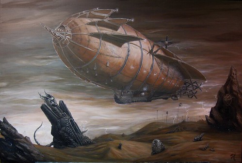
Cropped from the full-size piece to feature the airship only to make for a more up close, boldly detailed, and vivid view of the work (available as 18×12 metallic prints, and as 36×24 giclees on canvas in my store)

This desktop is 1800 x 1200, but can be resized or stretched to fit your needs.

Enjoy!

Desert Shadows 1200 x 800 Desktop
Posted on

Shades of Things to Come

A month back, I did a cover image for the Gatehouse Gazette, my second cover for them. The Gatehouse Gazette being a black and white publication, with a standard of using line-art for the covers, I decided to do the piece in pen and ink.

Though not exactly an expressive and creative masterpiece by any stretch, the piece made me happy looking at it, as it reminded me very much of the sorts of things I used to draw at my desk behind a makeshift wall crafted of several propped up books and a huge overfilled backpack. It also threw me back to the days of hoarding strange fiction pulp comic books, cyberpunk or dungeons and dragons manuals, and sci fi books – which I collected primarily for the artwork and imaginative worlds within.

I tend not to see works which simply look ‘neat’ or communicate a scene as art, more I see them as concept art or illustration, as such is typically the purpose of these works. No underlying meaning, no personal expression, no sociopolitical undercurrents or overtones, no mysteries contained within… just a scene from a story, a character or item from a book.

In this, as much as I looked at my line art piece, and desired to see it at its very-most complete, I thought it would be best to push on to other actual artworks – but this what rather hard to do, as the piece was continually, incessantly calling to me – so, in order to remove this distraction, I took to it with several tubes of acrylics and have been working at it a little each night.

I can’t say how oddly happy this makes me, as I work on it, and as I look at it at the end of the night – running my fingers over its surface as I know I shouldn’t – fascinated by the results because in all my time looking for that perfect surface for me – I never really gave bristol or illustration board a serious try, especially when it comes to paints. I like to at least have the illusion that my work will last forever and am forever trying to find more time tested and durable media to work on, to print on or to paint in. Though bristol has a high archival rating, I always think of all the things that could possibly happen to a piece over a few hundred years – and shudder to think of it.

The trade-off however – very nice. No tens of layers of gesso and sanding. No fighting/working with the grain of the wood or the texture of the canvas – a nice smooth surface which is easy to draw on before painting, and handles the paint rather nicely once a base coat has been applied.

It may not be an historic or ground-breaking work of art in the art world – it is however ground-breaking in mine. Not only have I found a new surface to love, but I have reminded myself once more that all art is self portraiture – as even though not intended, it unavoidably communicates the loves, interests, desires, fears, fancies, and soul of the maker… in this case maybe only my love for strange pulp fiction horror/sci fi, or perhaps a little more. I may never know, but I certainly won’t know until it is finished.

Well, enough of my musing… I now return you to your regular programming.

Oh… some progress piccies:

Gatehouse Gazette cover - pen and ink
Gatehouse Gazette cover - acrylic on Bristol W.I.P
Posted on

Lift Off Show in Alhambra, CA Jan 9th thru Feb 1

Today, I sent off three giclees to Gallery Nucleus for the “Lift Off!” art show, adding subtle miniature new artworks within each piece including (but not limited to) added airships, additional polar bears, bottles of rum, additional cephalopods, brightened constellations and other details in order to make each giclee its own unique piece of art.

For these I not only hand-stretched and varnished each one, but I have-made the supporting wood frames with a lot of extra care. I took some photos as I went, though admittedly it is hard to take photos of oneself working without use of a tripod, timer, and a lot of shots. Anyway, I got enough good shots to put together the tutorial this site has been needing for stretching and mounting canvas prints (Shipping giclees unstretched is a greener, less expensive solution – and stretching is not all that hard or expensive to do).

Oh… the show details…

Take Flight!
January 9th (opening reception) thru January 30th

GALLERY NUCLEUS
210 EAST MAIN ST
ALHAMBRA,
CA 91801
http://www.gallerynucleus.com

Posted on

This is Why We Can’t Have Nice Things!

Cover art for Gatehouse Gazette 10, my second cover for the popular Dieselpunk magazine.

Issue 10 will be released less than a day from the time of this posting, and can be found at ottens.co.uk.

Magazine Cover for GateHouse Gazette

(click the above image to view in larger sizes on Flickr)

I put it up for sale on Etsy, but I’ll likely pull it down if it doesn’t sell in the next day or so and paint it up with some acrylics for an upcoming show. If you would like to buy this piece, or would like to see what Bethalynne Bajema and I have for sale there, please go to Ettadiem.Etsy.com

Posted on

Desert Shadows – Now Available (in my store)

I reached the point where I *wanted* to add “just a little bit more”, but typically, as one learns over thousands of years of banishment to Earth, this is the point where one more brush stroke equals “overworked”. I waited about fifteen minutes just staring at the thing, and was happy with my decision.

Taking photos of paintings in artificial light don’t tend to yield the most spectacular results – there is a slight color shift seen from one edge to another (especially visible on the full shot). I’ll be getting it professionally scanned while I am away, proofing it when I return on the 29th, and since my printers are local – I’ll be able to start shipping these around January 11th.

They are however available now, in large limied edition metallics, limited edition giclees on canvas, and medium-sized open edition metallics (18×12 inches).

A bit about the painting:

I wanted the sphynx to be foreboding forgotten monolith, but I also wanted it to look “alive”, so I decided to put the tentacles emanating from the portal in the sphynx, putting the one winding around the back in the position a cat’s tail would be in were it thinkiing about ‘pouncing’.

In the shadows of this painting, are a night sky – something to dress up the dark spots, and to fulfill the need I had to make a starry sky out of my cloudy lightning-filled sky.

Desert Shadows (photograph of painting)

These weird shell things- I wanted rocks, but did not want them to be boring old rocks, I also wanted the desert to look almost as if it were a dried out ocean… so these fossil-like shell-like patterns in the stone served to fill these needs.

The lightning field – The way I wanted everything to be lit, required that lighting was coming in varying levels from many angles. I also love lightning. The floaty cages are a throwback to back when I did purely surreal artwork… and I thought they would add a nice ‘living’ touch to the landscape without ruining my desolate scene with actual plants.

ert Shadows (photograph of painting)

Lanterns everywhere – this one in the netting and reflecting off the portal window. A view of the coal bin, lightning field, floating cages, and propellers as well.

Oh… the nautilus. The nautilus-like submarine from “the Rescue”, now beached in the middle of the desert. Why??? … umm… Don’t tell me how to run my painting! It was a whim!

ert Shadows (photograph of painting)

Gondola – and lots of netting. More fishnet than a goth club on a Summer night. It serves well as extra cargo space. Ladders and doors for a sense of scale.

ert Shadows (photograph of painting)

The whole painting. Please forgive the obvious color shift from right to left, it is the result of uneven lighting on the painting when I took the shot.

ert Shadows (photograph of painting)